Usability Testing Check-In
Updates from Heuristic Analysis and Peer Review
Note that some of the changes we made at this step were to the core functionality of the prototype and do not match the heurisitics listed in our readings.
Creating User Profile
We did not have seperate personal profile creation pages for college students and applicants to support implied functionality in our prototype.
Heuristic Broken: N/A
Severity Rating: 4
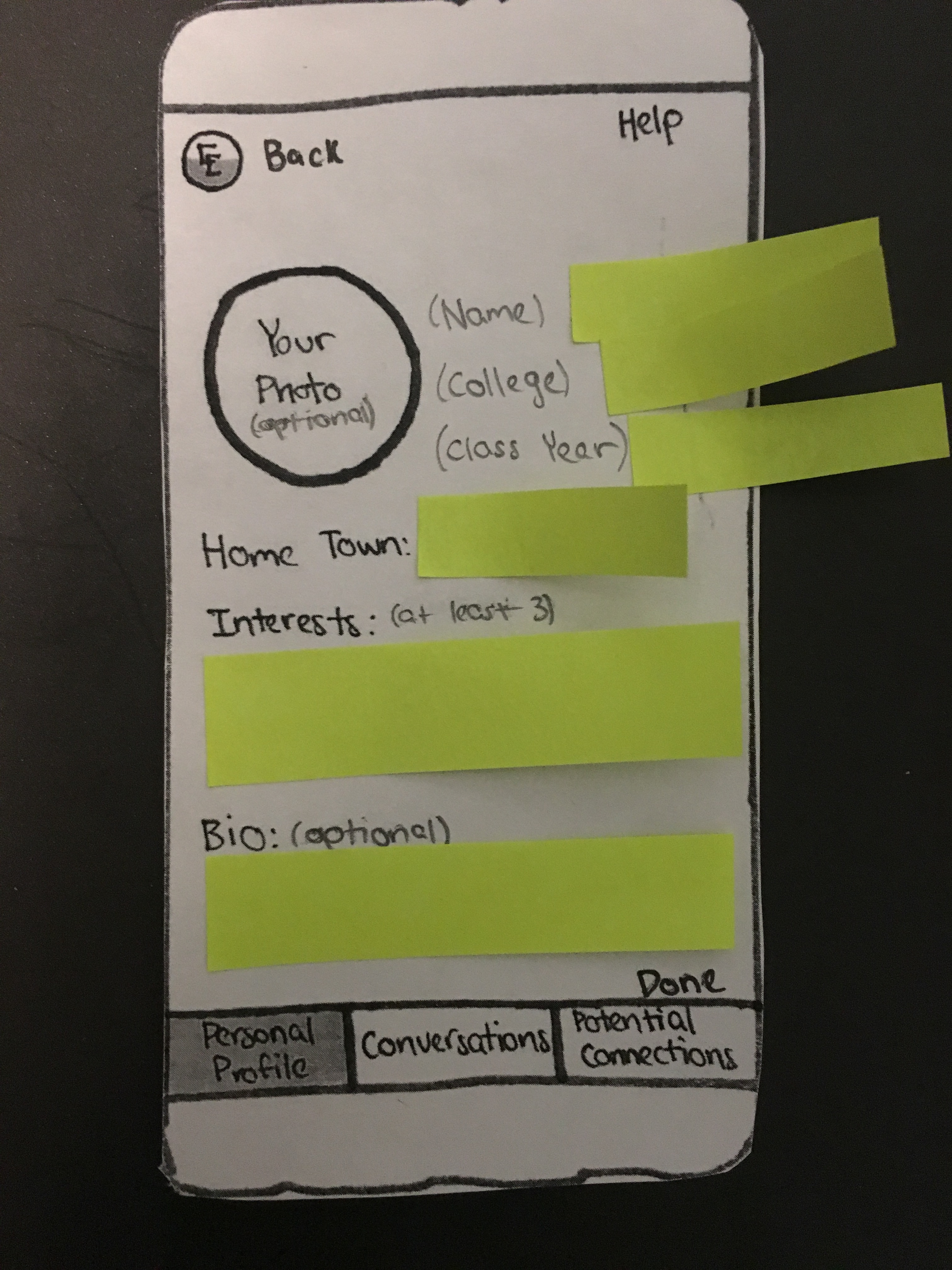
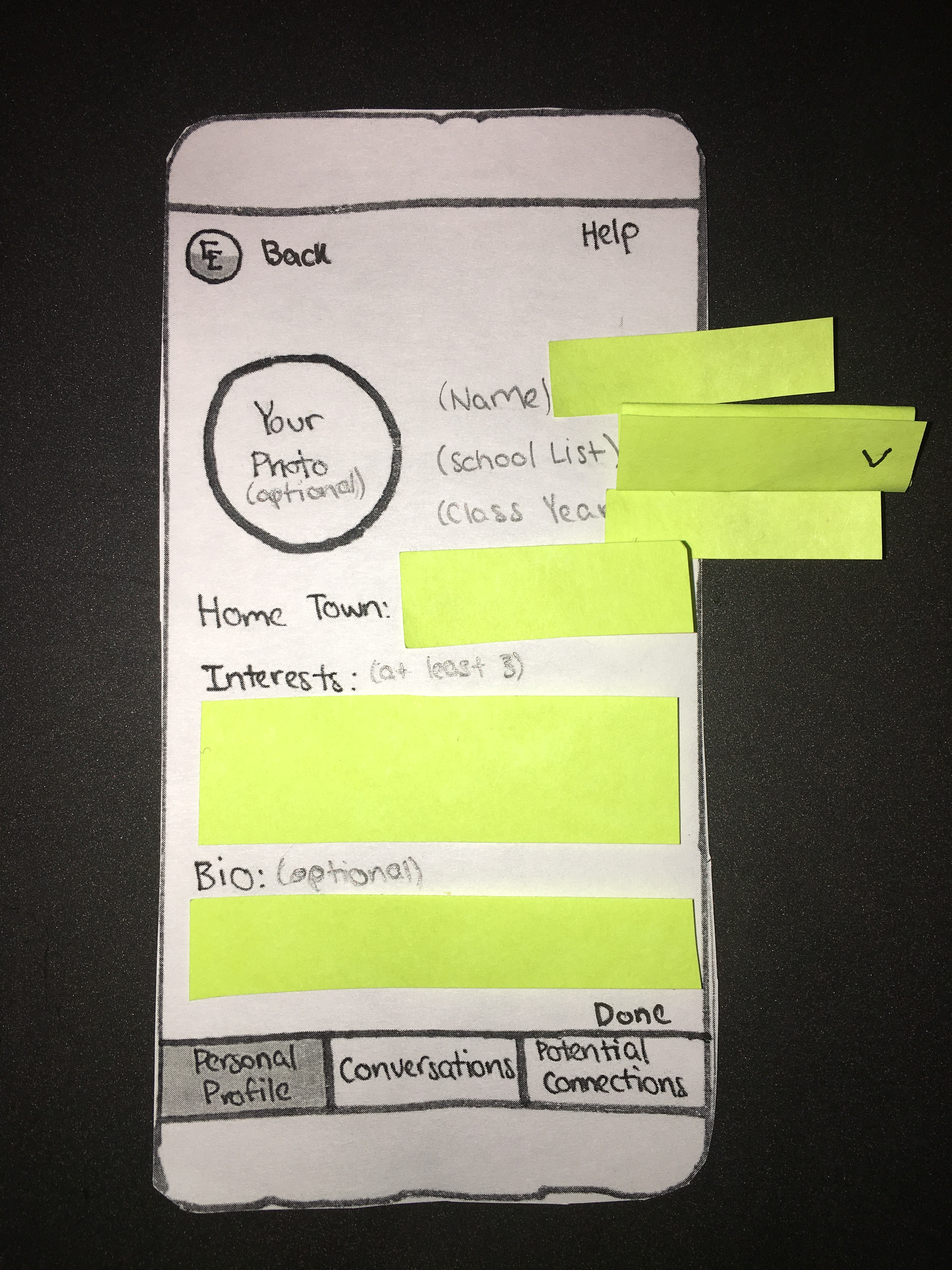
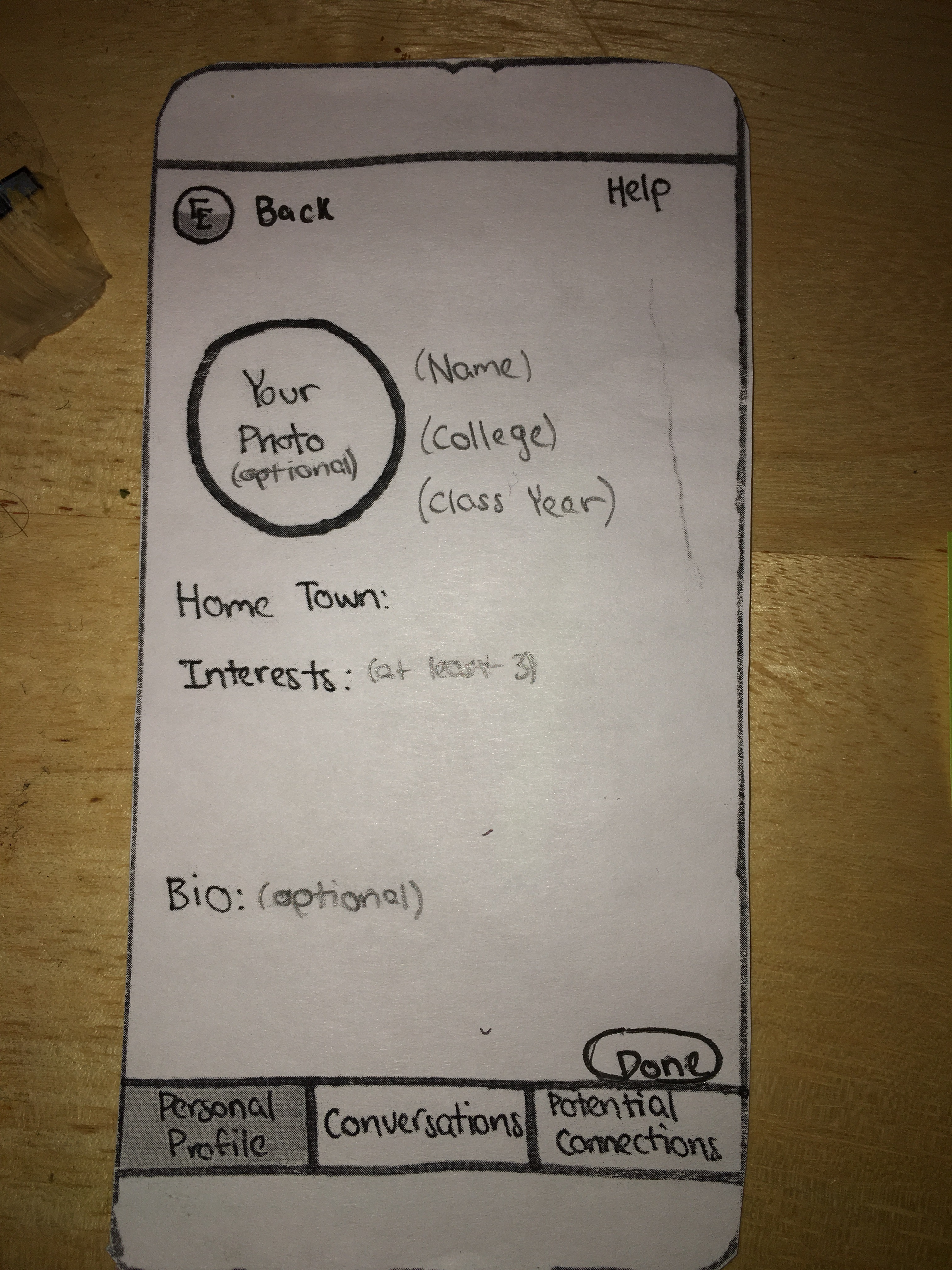
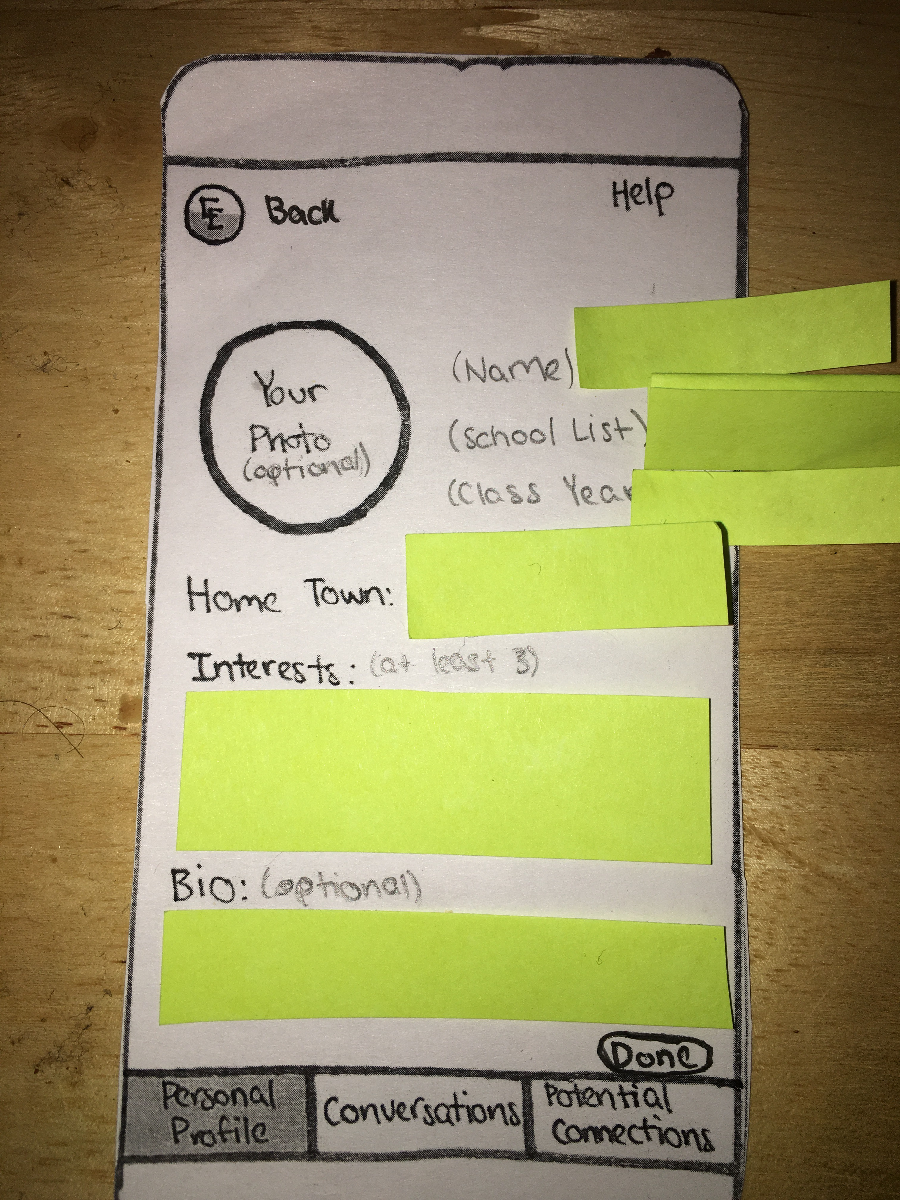
Solution: We added seperate personal profile creation pages for college applicants (right) and current college students (left). The primary difference between these pages is in the “College”/”School List” entry areas. The page for college students has a text-entry field where users can enter the college they attend. The page for applicants replaces this with a drop-down entry field for the user’s list of potential colleges, reflecting the different uses of the platform by these user segments.
The layout of our personal profile creation page did not leave space for users to fill in certain fields.
Heuristic Broken: N/A
Severity Rating: 2
Solution: We made the text in the “Name,” “College”/”School List,” and “Class Year” fields write-over (e.g. the text “Name” will be replaced by the name the user enters) to make a more effective and reasonable layout for the page.
Not enough direction was given in our personal profile creation page about how to complete all fields.
Heuristic Broken: Help and Documentation
Severity Rating: 2
Solution: We added “(optional)” text to several fields, as well as a brief description of the entry requirments for the “Interests” field to make the process of creating a personal profile easier for users to follow.
There was no way for users to back track during profile creation if they made a mistake.
Heuristic Broken: Clearly Marked Exits
Severity Rating: 2
Solution: We added a “back” button at the top left of the screen to allow users to back track if they select the incorrect user type in the previous screen.
There was no clear next step after users completed all fields on their personal profile.
Heuristic Broken: Clearly Marked Exits
Severity Rating: 3
Solution: We added a “done” button at the bottom left of the screen so that users can submit their information and be directed to the next section of the app.
Users often got lost searching through pages after completing their profile.
Heuristic Broken: Help and Documentation
Severity Rating: 2
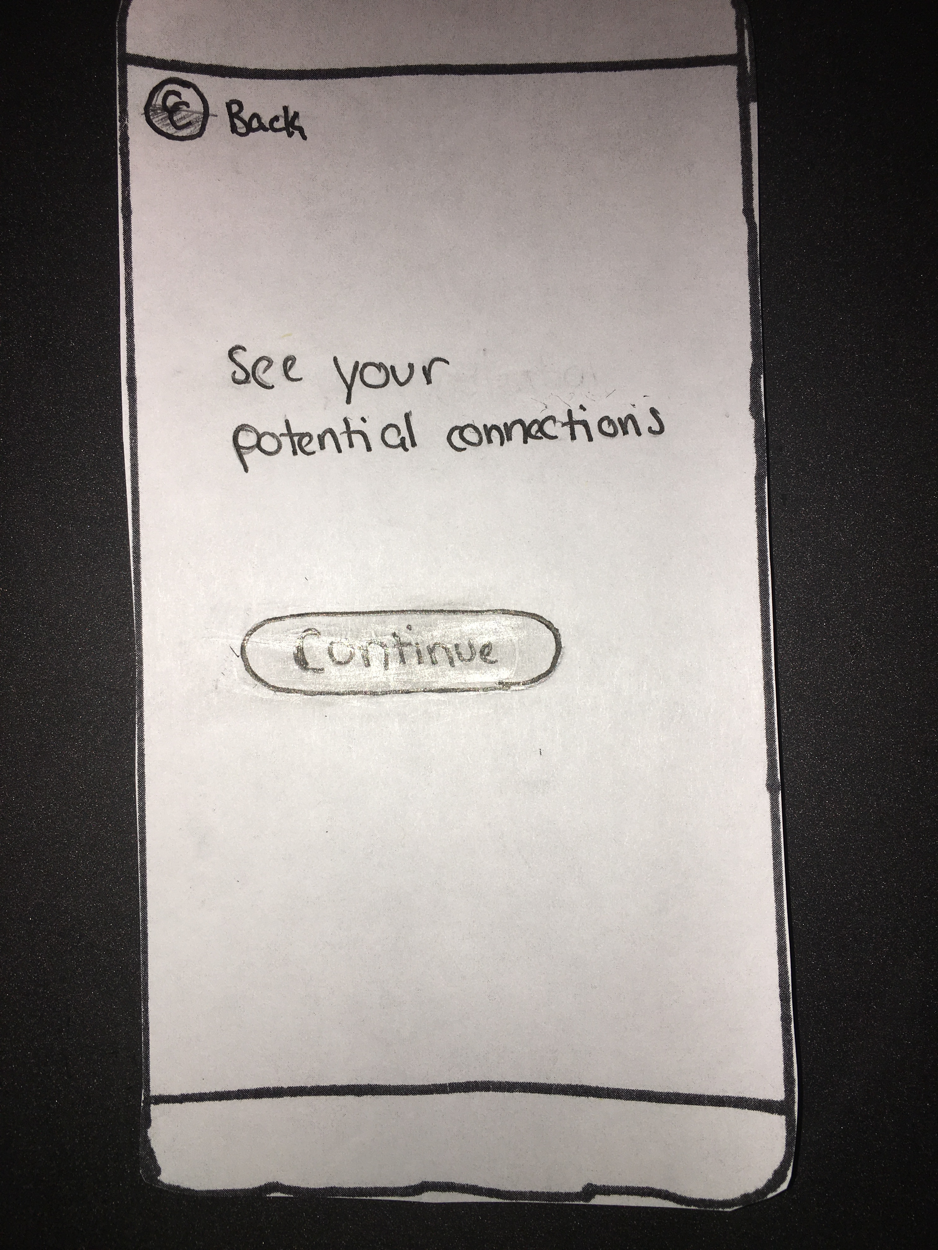
Solution: We added a page, which users will be directed to after completing their personal profile and clicking the “done” button, which will guide users to the “Potential Connections” page. This will remove ambiguity about how to navigate to the appropriate next section of the app.
Start Conversations
There was no option for audio calls.
Heuristic Broken: N/A (Privacy)
Severity Rating: 3
Solution:
We added an option for audio calls, as seen on the upper-right corner. This gives the user the option to only use audio call instead of video call, thus addressing the heuristic on privacy.
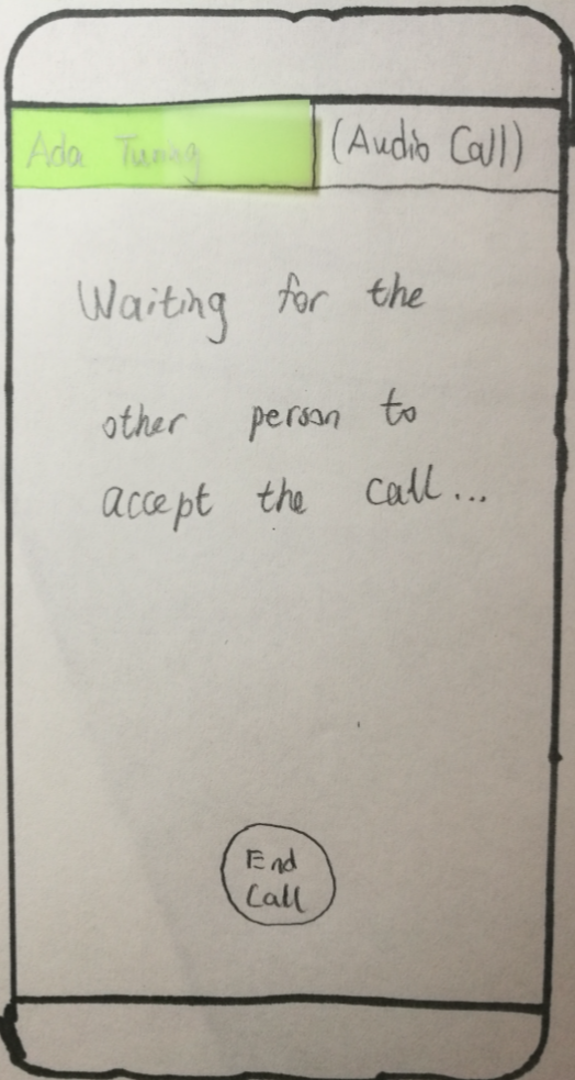
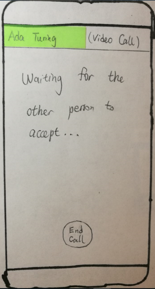
Interface after pressing the audio call button. Waits for the other side to accept the request. The user can press “End Call” to end the call.
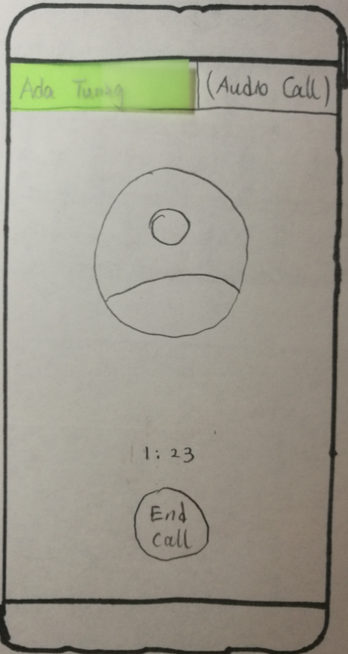
Sample audio call. Center of the screen shows the other user’s profile image. Press “End Call” to end the call.
Usability Testing
We conducted three usability tests with our paper prototype. All participants were current Williams college students and the tests were conducted in the common area of a Williams dorm. We chose this location to replicate the settings in which current students would likely interact with our platform–because it is a mobile app designed to promote casual conversation, we expect users to engage with it in familiar and comfortable environments while there are distractions around them. This environment choice was valuable in our testing, as it demonstrated which aspects of our interface demanded the most attention from users, and which aspects were most engaging to the participants. While it may be hard to replicate this environment with applicant users (it may be difficult to meet with high school students in similarly familiar environments), we hope to replicate this in future tests. Our participants were all current seniors at Williams. We chose these individuals because they have significant experience speaking to personal acquaintances about the college search process and hoped to see how this experience would translate into interacting with our platform.
For each usability test, we gave the participant a general overview of the purpose of College Connect, and explained the aims of our test. We then provided basic information about how to interact with the paper prototype (e.g. explaining that sticky notes represent text entry fields). After providing these basic instructions, we placed the initial (log-in) screen in front of the user and provided them with the first task of finding another user with similar interests to them. We phrased this first task as “find another user with similar interests to you.” After they completed this task (generally ending on the personal profile of the user they found), we posed the second task of communicating with this user over the platform. We chose to modify the phrasing of this second task to make it more applicable to the prototype, instructing the user to “connect with this user and have a conversation with them” (rather than to “speak with other users without repercussions from the college”). After completing this task, we asked the participants for any concluding remarks on the interface. Throughout this process, Dylan acted as facilitator, Julian as computer, and Wei as observer. The largest difficulty that we found throughout this process was the participant’s unwillingness to use the video and audio chat features. We hope to remedy this and further test these elements of the platform by having a user (the computer) initiate a call with the participant, and observing how they interact over these media. Additionally, we hope to encourage participants in future tests to think aloud more actively throughout the process.
Results From Usability Tests
Positive Incidents
-
All users were able to complete the given tasks.
-
Overall, they found the interface easy to use, especially the chat interface.
-
Users liked being able to choose across text chat, audio call, and video call.
Negative Incidents
- One user did not press the “Done” button after finishing filling out personal information. Instead, he went directly to the potential connections tab. We think this is a level 2 incident, which does not inhibit use of the app, but could cause users to get lost when first using the platform.
To address the issue, we made the following revision:
Here, we placed the “done” button in an oval to draw attention to it and to make its design more in line with that of other buttons on the platform.
- After clicking “continue” on the page that says “See your potential connections”, two users were unaware that they were already on the potential connections page. We think this is a low-level severity incident.
To address the issue, we made the following revision:
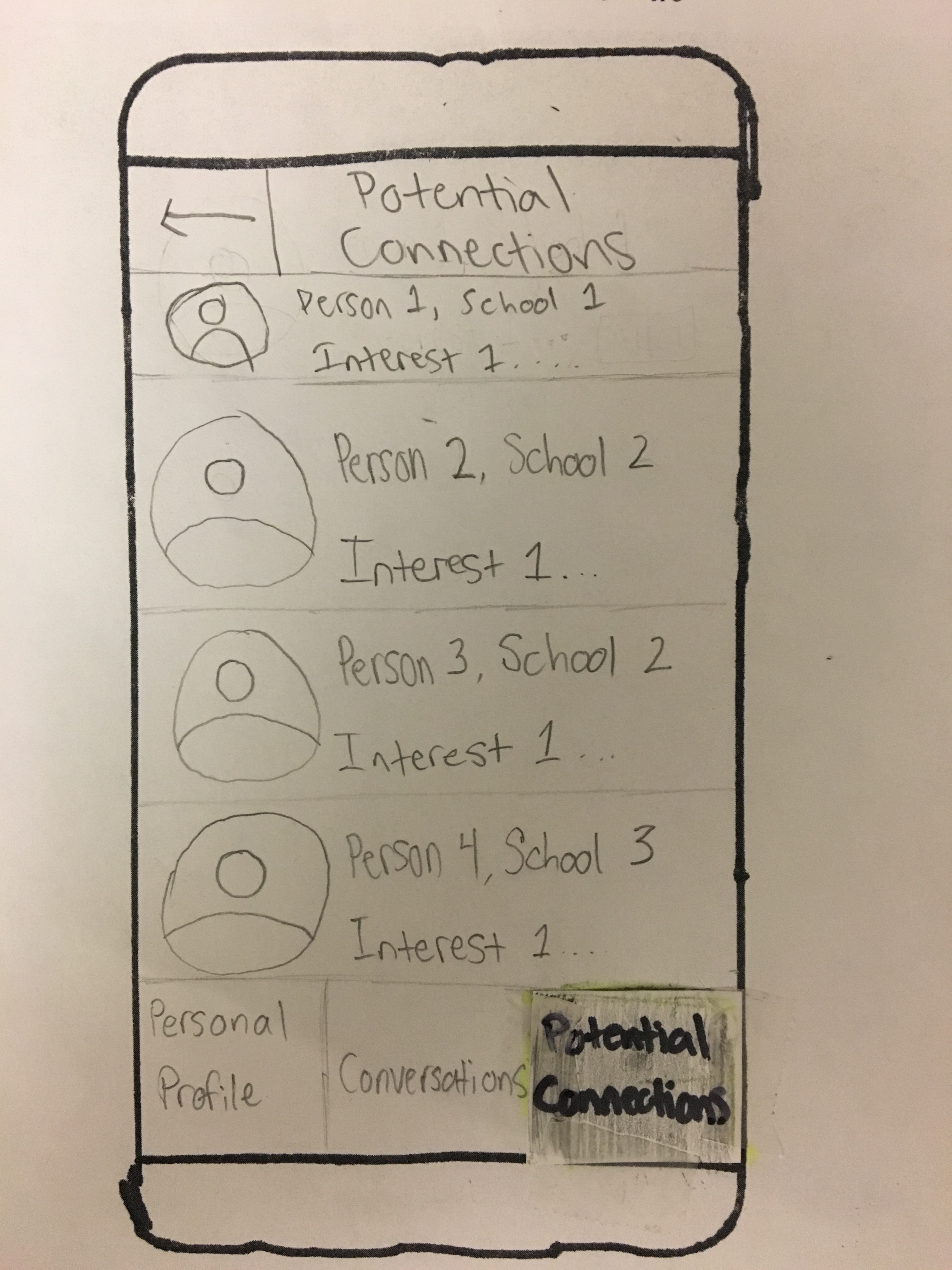
The currently selected tab is written at the top, with a back button for easier navigation, while the darker colors on the bottom button will make it clear that it is chosen.
Future Plans
After having conducted usability tests with college students, we now need to run usability tests with college applicants to get an understanding of how they will interact with our app. We will have a member of our team respond to the user’s message and ask the user to make voice/video calls and have real-time conversations, so that they are less hesitant to make these actions than in cases without presence of message replies. In future tests, Dylan is the facilitator, Julian is the computer, and Wei is the observer.
Current Paper Prototype
Overview
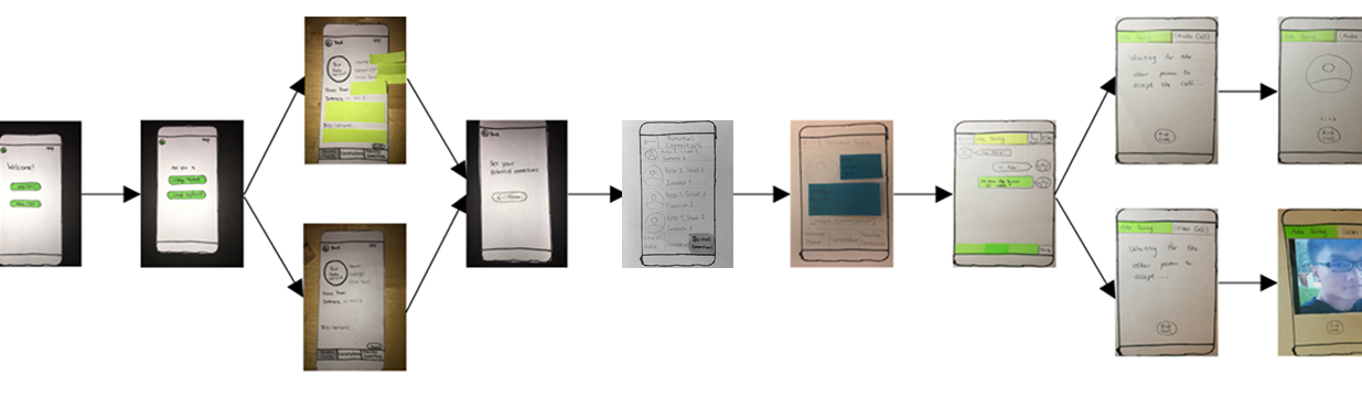
Share Personal information
Upon first opening the College Connect app, users are presented with a simple welcome screen.
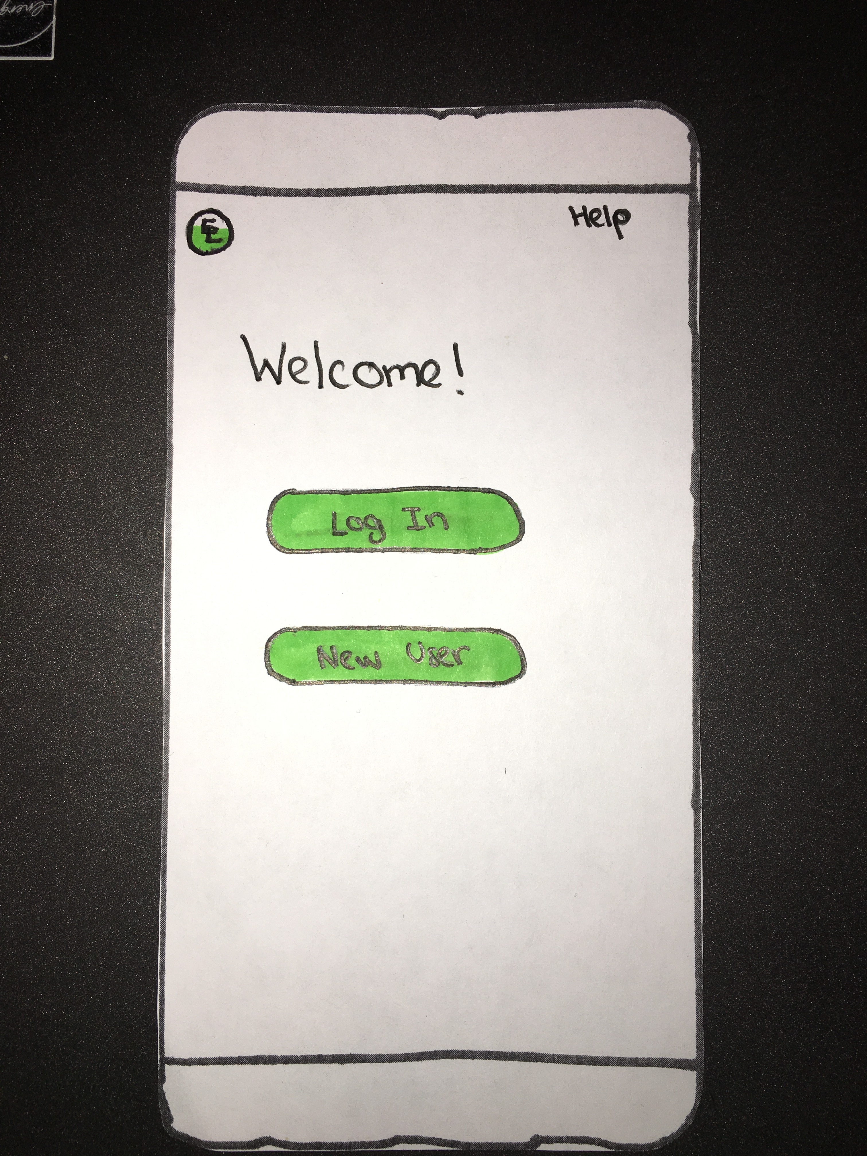
If the user has already created a College Connect profile, they will log in and be directed to their “Conversations” page (see below). If this is a new user, they will select “New User” and will be directed to a screen allowing them to choose their user type.
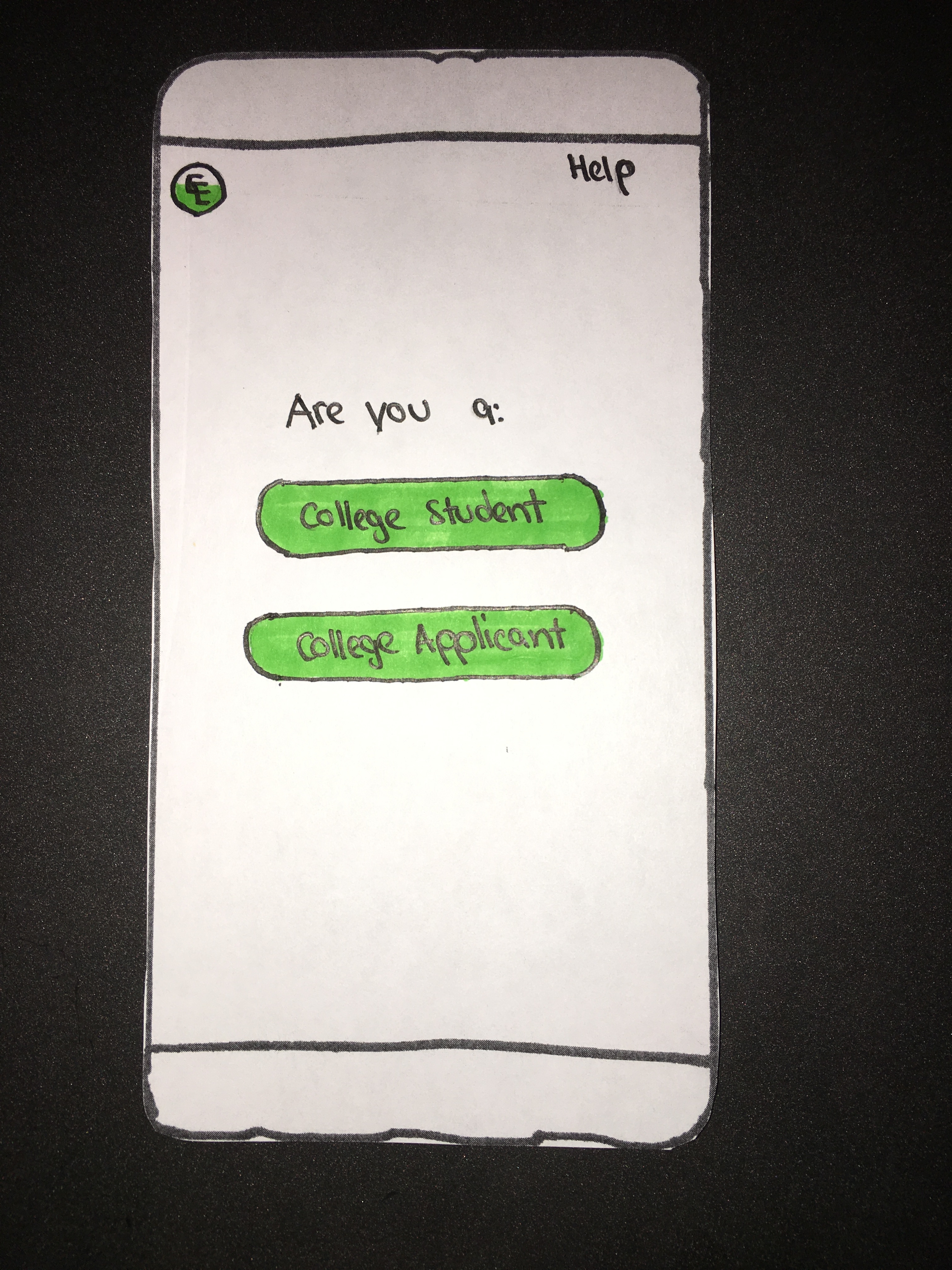
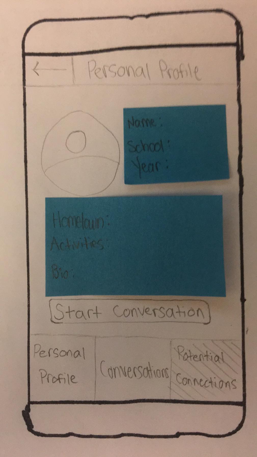
After the user selects the appropriate type, they will be directed to their personal profile screen, where they can share basic information about themselves. The screen will be slightly different for current college students (left) and applicants (right) This information includes their name, school (college students) or prospective schools (college applicants), class year, home town, interests, and a short personal bio.
After they complete their profile and press the “done” button, they will be directed to this screen, which will guide them to the potential connections page.
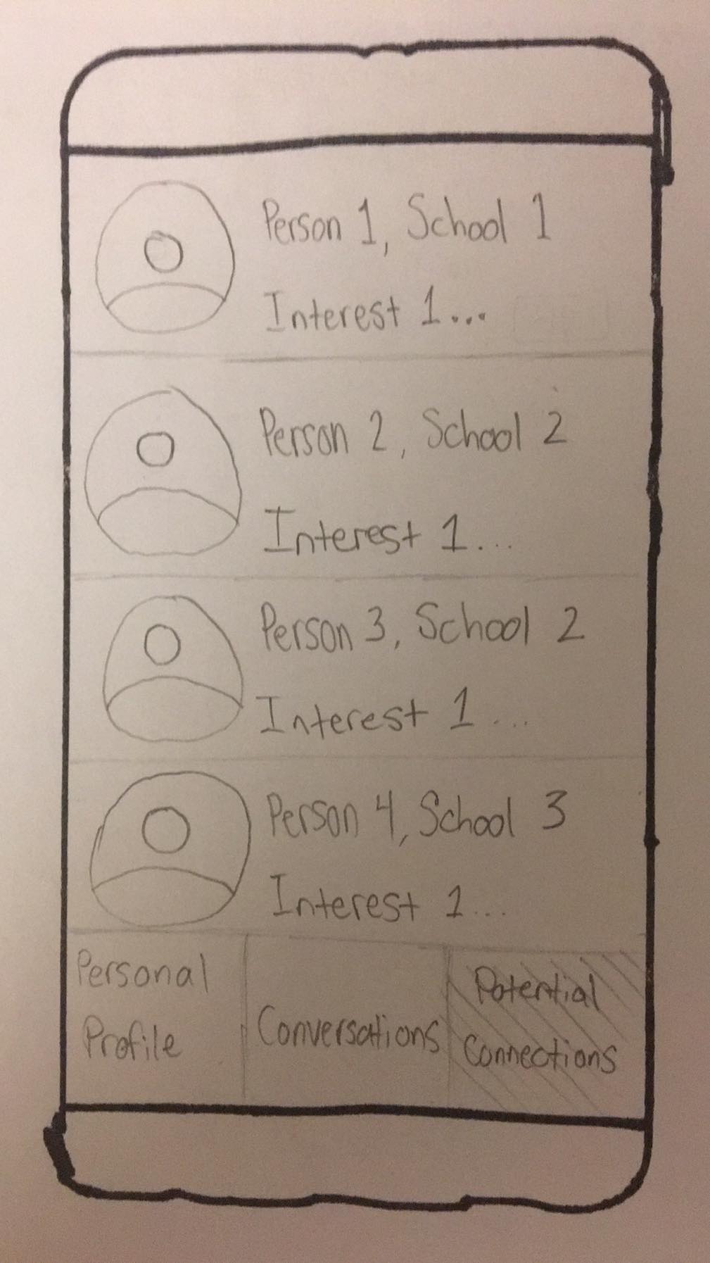
Find Users with Similar Interests
- Once the user has input their interests, they will see a list of either college or applicant students with similar interests. They can then select someone to learn more about them and other shared information.
- After they have selected a student, they can decide to initiate a conversation and/or learn more about others using the back button.
Start Conversations
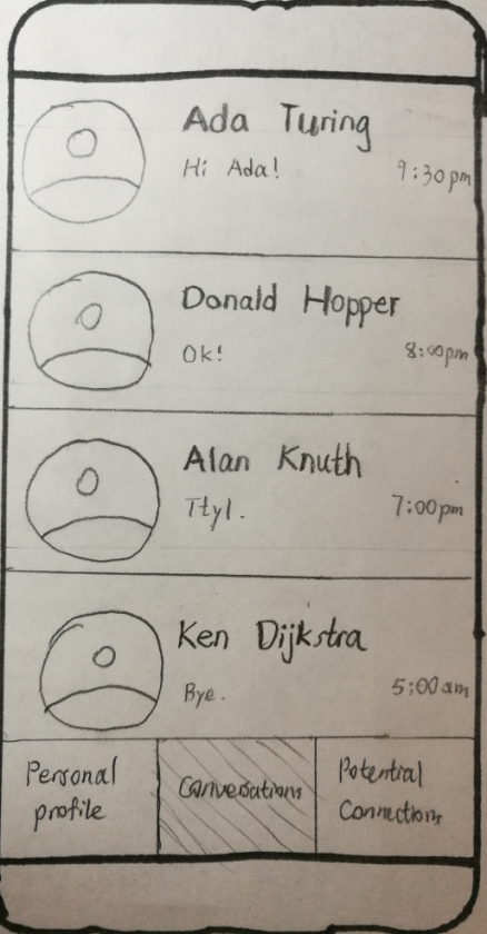
- The user can press the “conversation” tab to navigate to the conversation interface. This interface shows the user’s conversations with other users, order by recent messages. The user can press the tab with the person’s name to begin chatting with that person.
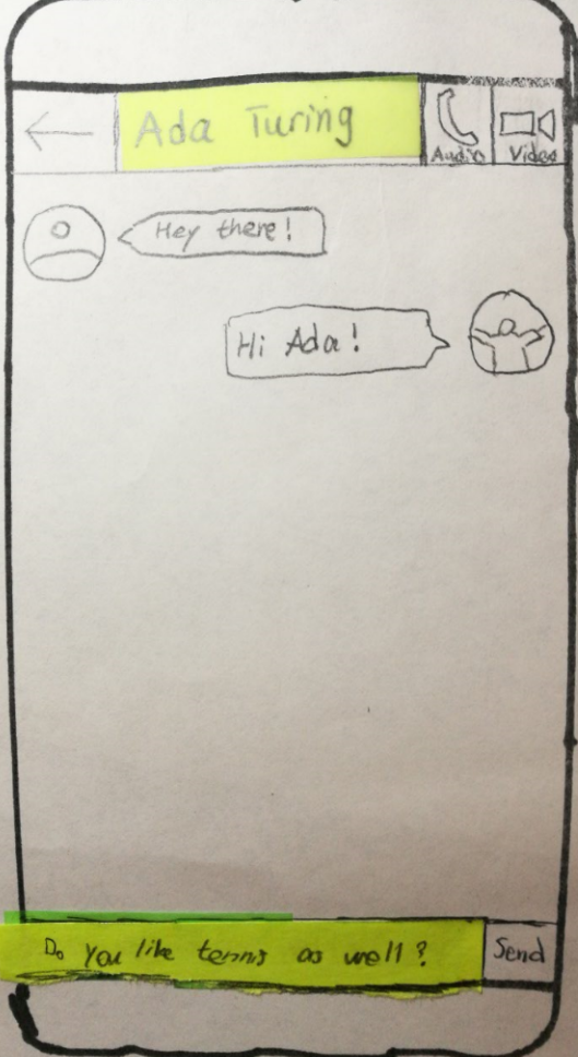
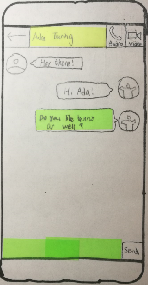
- This interface allows the user to chat with another user. At the top-left corner, the back arrow takes the user back to the previous page. The name of the person with whom the user is chatting is displayed at the top. At the top-right corner are options for audio call and video call. Messages are shown in the main body of the interface, with the other person’s messages on the right. At the bottom, the user can enter a message and press “send” to send.
- Sent message.
- Interface after pressing the audio call button. Waits for the other side to accept the request. The user can press “End Call” to end the call.
- Sample audio call. The user can press “End Call” to end the call.
- Interface after pressing the audio call button. Waits for the other side to accept the request. The user can press “End Call” to end the call.
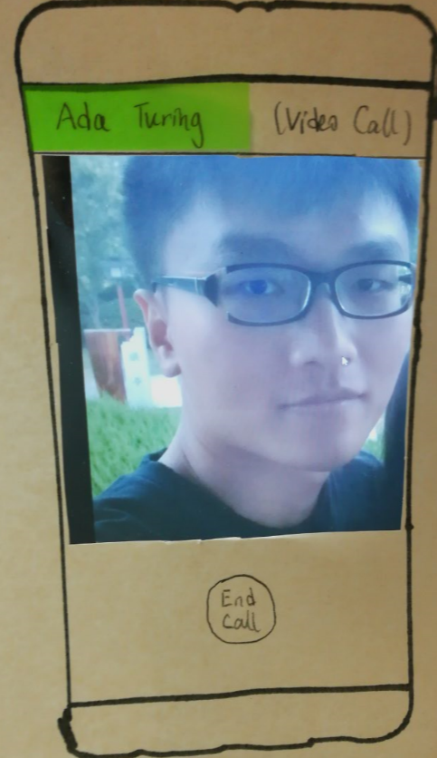
- Sample video call. The user can press “End Call” to end the call.