Introduction
I came into this course with limited understanding of design principles and how these ideas worked to inform the creation of useful and intuitive products. I anticipated that this course would primarily provide basic guidelines about how to make software effectively serve its users and concrete rules to follow when creating a new platform. What I learned, through the process of designing College Connect, however, was that design cannot be simplified to a set of static standards. Rather, design is a process. While some guidelines can be useful in the creation of a product, creating software that meets the needs of its users requires the constant input of the diverse groups of individuals who will interact with it. We, as engineers and designers, cannot simply fit our ideas about how a platform should look and behave into previously established standards and expect to create a product that suits our users or fulfills their requirements. Instead, we must actively take the input of users into account at every step along the way.
Importantly, the process of designing College Connect was primarily one of expansion. We began with what seemed like a simple idea: to connect college applicants with current students. We believed that the college search process was difficult and often prohibitive, particularly for applicants who were geographically removed from their prospective colleges or who did not have the financial means to visit the schools they hoped to attend. While these beliefs were confirmed throughout our design process, we could never have predicted the nuanced experiences of applicants and students or the insights that these individuals could provide on the college search process and how we could improve it. These insights pushed us to consider user needs and aspects of our platform that my teammates and I would never have seen without engaging our potential users .
While I will discuss several principles that were central to my personal design experience here, I do not hope to suggest concrete rules for future design. Rather, I hope to highlight some of the key lessons I learned as my team developed College Connect from our initial proposal to the product that we have now. The following aspects of my personal design process are guidelines that I will use to shape my future design efforts and keep in mind whenever I set out to answer user needs in a new platform.
Accessibility: A Constant Consideration, Not an Afterthought
In designing College Connect, we looked to accessibility considerations too late. We went through several iterations of our prototypes without thinking about how users with different abilities would interact with our platform. Particularly for a platform that was motivated by the desire to make the college search accessible to all applicants, this was a significant oversight. In future design processes, I would work to incorporate the perspectives of differently abled users beginning in the ideation phase. While our contextual inquiries provided us invaluable insights into the needs of our user segments, observing and speaking with users with disabilities could have informed us of requirements that are not considered by fully-abled users. Further, while I believe the tasks that our team worked to serve–allowing users to find others with similar interests to them and to speak with these users candidly–are important for anyone in the midst of the college search, we could have formulated these tasks in a way that took into account different modes of interacting with the app we designed. Additionally, completing usability testing with users of different abilities would help us to avoid simple oversights that make our platform less accessible to certain potential users. Looking to our readings on accessibility (particularly The Dos and Don’ts of designing for accessibility), we could have better reduced user memory load in the personal profile creation pages by suggesting content for the various text entry fields and made our buttons more descriptive. While these specifics can still be incorporated into the College Connect design, our failure to recognize them suggests the need to consider accessibility at every step of the project. Incorporating principles of accessibility makes the platform better for all users, and I hope to make it an active and significant part of my design process in the future.
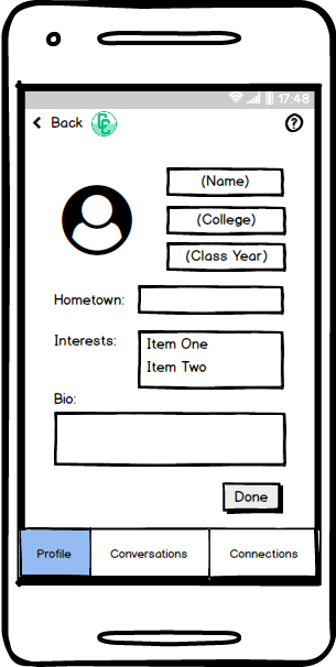
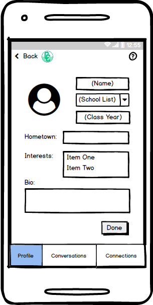
Personal profile creation pages for college students (left) and college applicants (right).
Ethics: Every Choice has Consequences
The ethical consequences of a platform are often overlooked in the pursuit of a product that meets the stated and imagined requirements of users. While creating College Connect, we often implemented features that we thought would allow our users to better accomplish their desired tasks without realizing the potential ethical impact that they would have. In particular, privacy is a significant concern in our platform. College Connect is predicated on users sharing personal interaction and interacting with other users who they have not met before. Ensuring that users’ privacy is protected throughout all of these interactions is key to ensuring that applicants can receive the information that they hope to gain from our platform in a comfortable and safe environment. The need to consider privacy when developing online platforms, particularly social platforms, was highlighted in Fowler’s article, When the Most Personal Secrets Get Outed on Facebook, which details the experiences of queer college students whose sexual identities were unintentionally revealed on Facebook, causing significant conflicts in their families. In order for our platform to effectively serve our users, we need to make every effort to avoid these types of unintended consequences. When one of our usability testing participants expressed concerns about her privacy being violated on the app, we decided to make it easier for users to choose who could contact them on the app, providing an interface to explicitly accept or deny contact from other users. Through this process, I came to realize that designers must constantly be cognizant of the ethical implications of their designs and ought to listen closely to concerns raised by their users. These concerns often identify larger risks that jeopardize both user security and the usability of the platform as a whole.
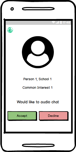
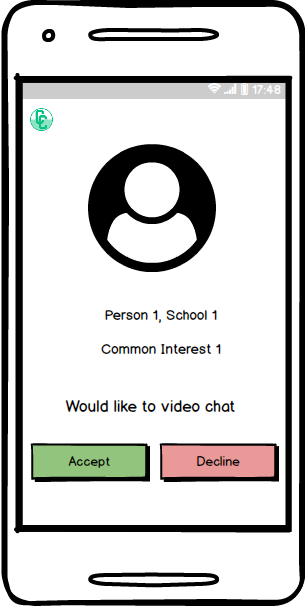
Pages allowing users to accept or deny audio (left) or video (right) call requests.
Iteration: You Won’t Get it Right the First Time
If this project taught me anything, it is that iteration is key to effective design. Our initial paper prototype contained only eight screens, compared to twenty in our digital mockup. While our guiding tasks remained constant throughout the design process, this expansion is indicative of the value of rapid iteration on our designs and the value of incorporating user feedback into our platform. By putting the various iterations of our prototype in front of users and hearing their feedback, we were able to identify the shortcomings of our initial efforts and develop a platform that fully encompasses our users’ potential paths to complete the tasks we identified. Using low-fidelity prototypes, we were able to quickly incorporate user suggestions and hear direct feedback on each progressive step of the design process. This constant iteration forced us to critically engage with our potential users and ensure that their actual needs, not our ideas of them, were met. Additionally, rapid iteration allowed us to test various methods to address user input, keeping those aspects that worked for our participants and easily scrapping those that did not. Importantly, with each iterative improvement, several new design flaws came to light. These constant revelations of new areas for improvement showed that iteration needs to be a constant process throughout all phases of design–we, as designers, can never fully understand the needs and desires of our users, and thus we can only create an effective platform by continuously testing and adapting our designs. Sometimes this process of quick change was difficult, especially when it required changing or removing a piece of the design that we thought was complete or effective, but it ultimately tethered the design process to the needs of real users and forced us to realize when our expectations did not match users’ reality.
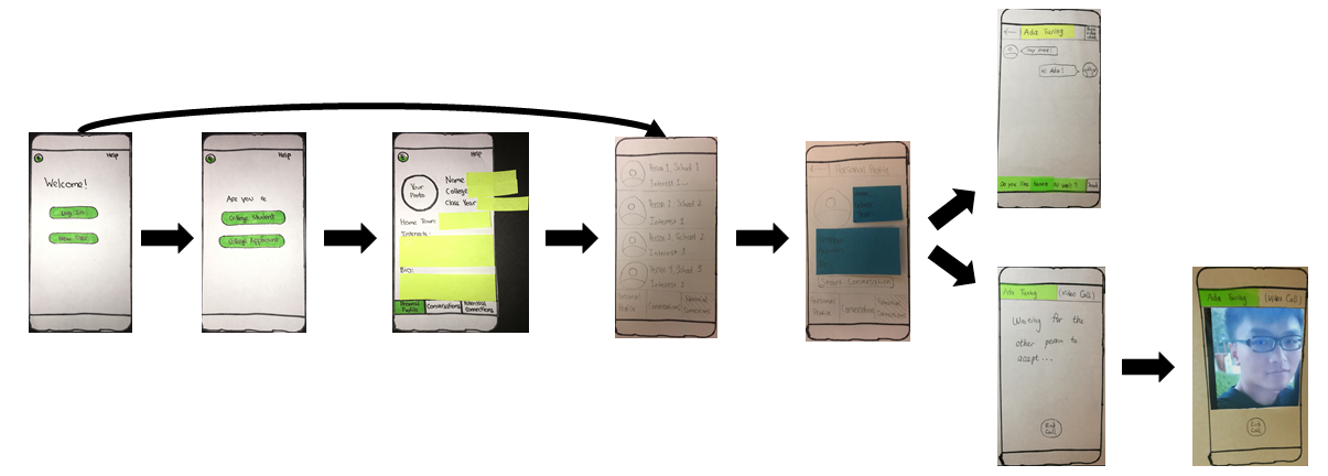
Our initial paper prototype.
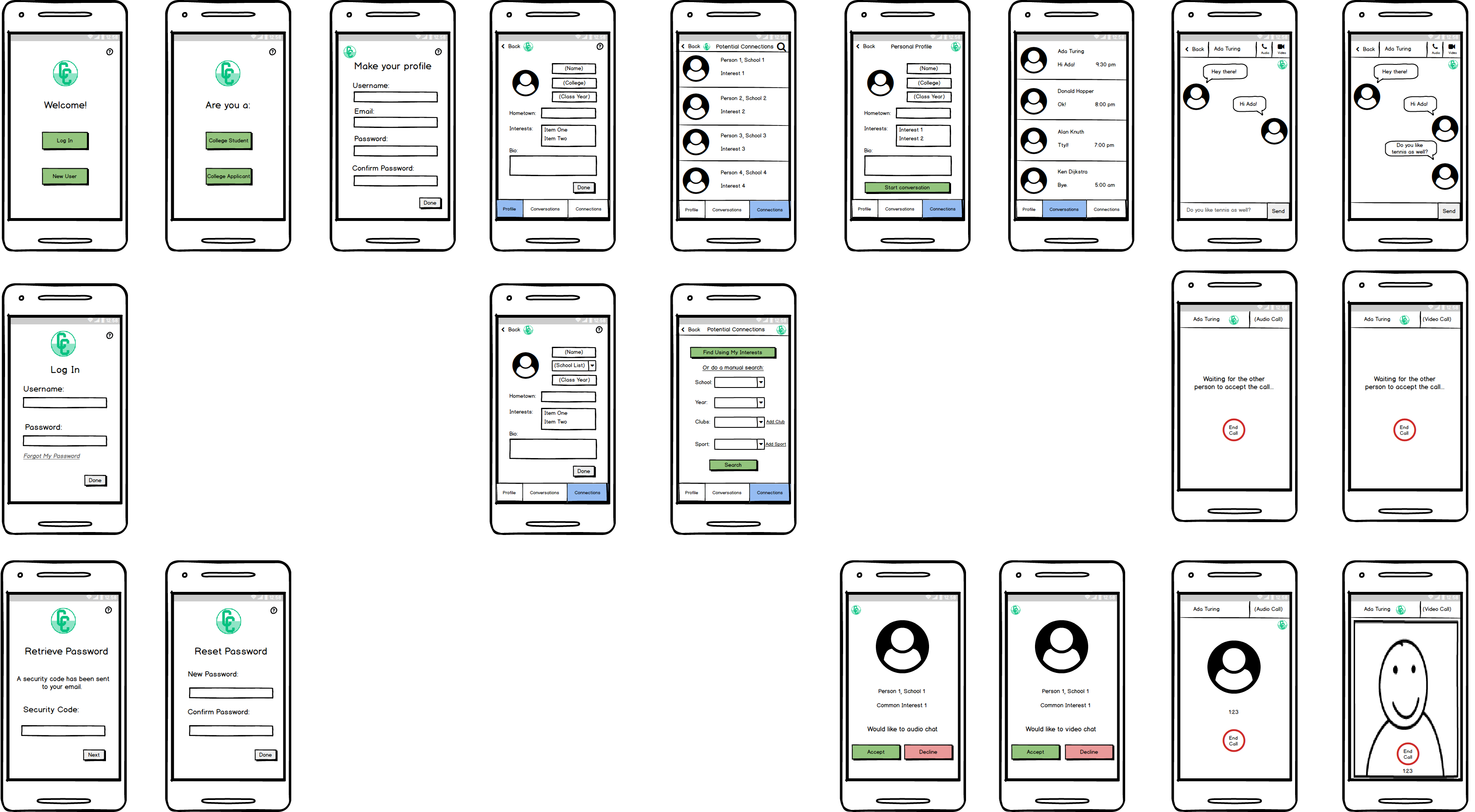
An overview of our digital mockup.
Expansion: Balancing Addition and Refinement
There is always more that could be added to a design. At each phase of our design process, we became aware of additional functionalities that could improve College Connect and pages that could be added to make the current functionalities more clear. However, it is important to strike a balance between incorporating new elements into the design and refining what has already been implemented. While I feel that most, if not all, of the additions we made to our prototype were necessary to effectively serving our users and allowing them to accomplish the core tasks we identified, we often erred on the side of addition throughout our design process. In future design efforts, and in a continuation of this project, I would devote more time to ensuring that the elements we have already incorporated into the platform are fully functional and are providing as much functionality as possible. As an example, when users had difficulty navigating past the personal profile creation section of our paper prototype, we chose to add an additional page which simply directed users to see their potential connections. A more elegant solution, which we implemented in a later iteration, was simply to make the buttons on the personal profile creation pages more distinct and descriptive. This instance made me realize the importance of deeply engaging with user comments and behaviors–sometimes broad user needs are hidden in their stated wants. Thus, it is essential to think about user criticism not simply as a direct demand for more functionality, but rather as a guide to make already present functionality better. With this in mind, I will actively consider if an issue revealed in user testing can be solved through modification of present design elements before adding more to the platform.
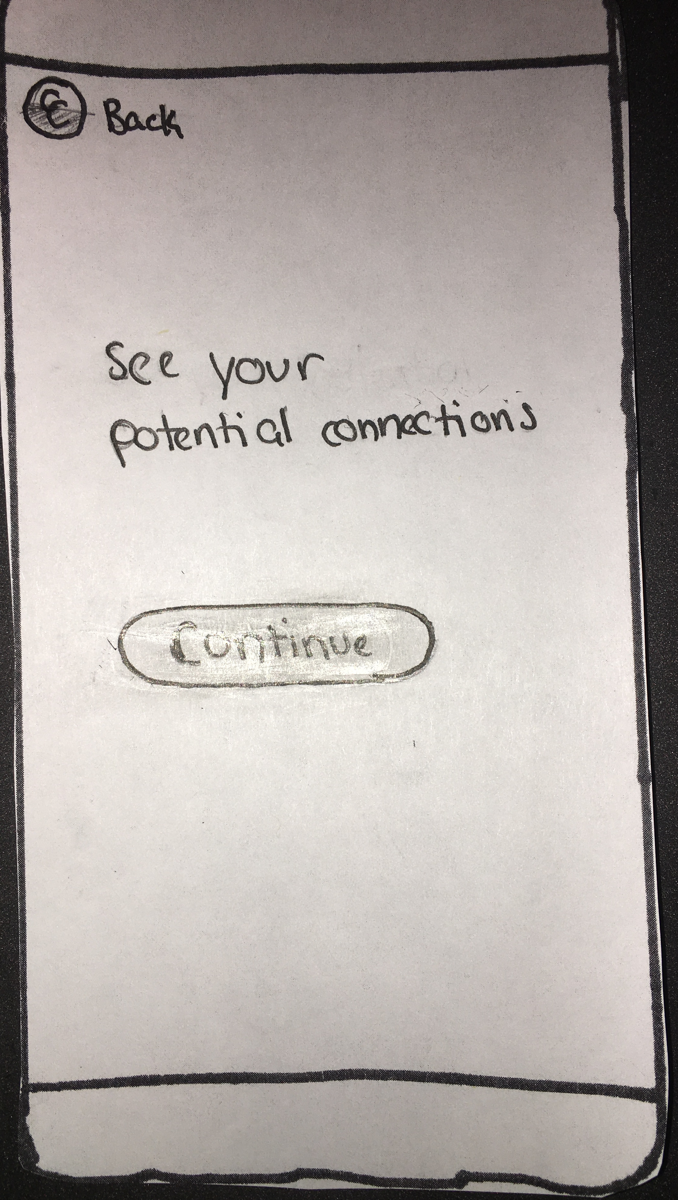
The “View Potential Connections” page which users were directed to after completing their personal profiles.
Teamwork: Two (or Three) Heads is Better than One
While engaging with users throughout the design process is essential to creating an effective platform, it is equally important to actively collaborate with fellow design team members while developing the product. When considering user input, particularly in the contextual inquiry phase, my teammates consistently noticed aspects of user behavior that I did not. Additionally, when interpreting the feedback we received during usability testing, my teammates were able to utilize their unique perspectives and arrive at understandings of user needs that I never would have realized alone. Their perspectives brought to light key flaws in our design, as well as creative ways to address user needs. Without collaborating with my teammates on key design decisions, the College Connect app would be heavily influenced by my personal and limited perspective, significantly restricting the potential of our platform. Working with a team, I was pushed to consider alternate ideas about how to accomplish the tasks we identified for the platform and expanded my own design perspective. The need for active and open collaboration is highlighted by Beyer and Holtzbaltt in their chapter on Affinity diagramming: “each person’s different perspective is shared, and a common perspective is built through discussion” (162). By bringing together our disparate experiences, we were able to build a common perspective that better encompassed our users’ needs than any of our individual interpretations could have. Key to this collaborative success was the willingness of all team members to share openly; by expressing their full and honest opinion to the group, each team member introduced new observations and insights that deepened the shared perspective and improved the final design.

Our affinity diagram for observations from contextual inquiries.
Conclusion
A common thread runs through each of the core design principles discussed above: the need for engagement with multiple perspectives. This theme articulates the central principle of Human Centered Design. To effectively create a product to solve human needs, we must engage with the people who experience these problem. As designers and engineers, we have an obligation to build platforms that not only meet our technical and design requirements but also address the lived experiences of the individuals who will use these products. Imperative to this requirement is the inclusion of these individuals in the design process. Throughout this course, I came to realize the central importance of user involvement in the design process–no matter how elegant a platform or program is, it cannot effectively serve its users if it was not designed with their involvement. Thus, my design manifesto stands as a guide to effectively and critically engaging user input. We must communicate with and fully acknowledge the input of all types of users, differentiated by ability, experience and context. We must further work to interpret this feedback through our own expertise to create platforms that are centered on the people that they will serve. While it is impossible to incorporate every perspective into a platform, we must work at every step of the design process to come as close to this standard as possible.